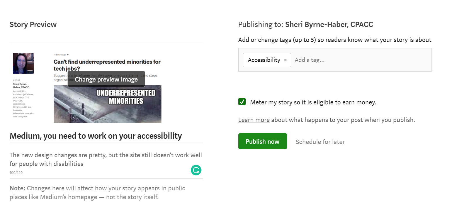
The new design changes are pretty, but the experience for people with disabilities using assistive technology is still quite poor, especially for authors.
Accessibility is the ability of people with disabilities to use software or consume information equally to people without disabilities. Just a few of the most common accessibility concepts include:
- Color choice — being sensitive to the fact that 4.25 % of the population can’t see red and green, and people over 55 have difficulty reading text with poor contrast against the background color.
- Closed captioning — hearing loss is the most common congenital disability. People tend to lose hearing as they age due to noise exposure, infections, injury, or ototoxic drugs.
- Keyboard access — to be accessible means NOT assuming that everyone can use a mouse or touch the screen. That means every function and component that can be accessed by mouse/touch must also be accessible from the keyboard.
- Descriptions for non-text graphics — Alt-text is the ability to describe pictures for people who use screen readers.
I will make this ask at both the top and the bottom of this article — even if you don’t read the whole article, please add a comment if accessibility is important to you or if you have run into an accessibility problem with Medium.
What Medium has done right
Medium finally implemented alt-text about a year ago. Before Medium implemented alt-text, if an author wanted to describe a picture, they were forced to put the graphic description either in the graphic caption or in the article’s text. One of the accessibility best practices that are inherently integrated with alt-text is that the descriptions are usually hidden from sighted individuals because they can see the picture. To sighted users, text descriptions for graphics are clutter.
What Medium could do better with alt-text
- Right now, Medium has limited the alt-text field to 125 characters, which is fairly short. If the picture is complicated (like a chart), then I’m back to the days of putting the description in the caption or the text, irritating other users who don’t need that information.
- There is nowhere to indicate that a picture is just there to be pretty (the accessibility term for this is “decorative”). Sure, you can not bother to set the alt-text, but then the blind user doesn’t know if you left it empty because you are lazy or if you intended for them to interpret the picture as unimportant.
Alas, alt-text is only one of 50 guidelines in WCAG 2.1 Level AA (it will be increased to 59 in the upcoming WCAG 2.2 update). And Medium has not done a great job at implementing some of the other 49 as I will describe in detail in the remainder of this article.
Authoring interface
The authoring interface is the biggest Medium accessibility problem. For assistive technology users, it is inaccessible at worst and really hard to use at best. Keyboard access is the most important aspect of accessibility because many forms of assistive technology like screen readers and switch devices don’t work when you can’t get to things without using touch or a mouse.
Also, Medium does not support keyboard focus indicators in the majority of locations. The current behavior indicates a deliberate choice by Medium because the default browser focus indicator is also being suppressed.
As a keyboard-only user who also uses magnification, it’s challenging to figure out where I am when using the interface.
As a result, I usually create my articles in MS Word or Notepad, and then do a copy and paste dump into Medium and add a bit of formatting.
Sometimes if I am tired or in a hurry, I pay someone else to do the formatting for me.
Analytics
Again, authoring analytics are completely inaccessible.
- There are complicated charts with no alt text.
- There is no ability to download the data in a raw format to build accessible data access in Excel.

Publication interface
Keyboard accessibility on the publication screen is haphazard. The ability to navigate the tag list via typeahead and errors is perfectly implemented from the accessibility perspective. However:
- The focus order of objects on the page is difficult to follow because of the lack of focus indicators. I have to know that it takes 8 tab key presses to get to the tags because I never know visually where I am.
- The tagging section buttons have a “kill” switch with an X that you can get to from the mouse to delete a tag you erroneously created. However, it took me a lot of painful trial and error (because of the lack of a focus indicator) to realize that shift-tabbing and then hitting the return key would remove an erroneous tag.
Medium does not have much in the way of dyslexia-friendly choices.
Medium is not particularly dyslexia-friendly.
- The Dropcap feature, which thank goodness was recently abandoned, was terrible for readability. And don’t even get me started on the previous ability to customize drop caps: worst feature ever from the accessibility perspective, and good riddance.
- I recently had an article rejected by a publication because I wasn’t following Medium’s block and pull quotes guidelines. However, these guidelines are terrible for people with dyslexia because you get long strings of italics that are very difficult for people with dyslexia to read.
- Medium has recently added a “design” page where you can select fonts. However, the options are only serif and sans-serif—no dyslexia-specific font options are available.
- There is no article spacing override. If you need a different letter, word, or line spacing to make reading more comfortable for you, you are SOL.
The App
So far, everything I have discussed pertains to the desktop HTML version of Medium. As someone who needs screens to be magnified to 200 % to see comfortably, I rarely use the native app to draft or publish articles because of the limited screen real estate. However, if I do have an idea and what to jot down notes before I forget, I will open the app, start a new article, and dictate a couple of sentences. That works well enough. But it is fairly difficult for me to accomplish more than that via the mobile native app.
The comments below pertain to the iOS interface that a Medium reader would experience since I don’t have access to an Android device at the moment.
- No headings on the home screen. That makes it slow to move from topic to topic. You can’t get to “new for you,” for example, without paging down. If it were a heading, you could use the screen reader to navigate directly to it.
- Decorative objects get announced, such as all the dots between the timestamp and the read length. That slows things down considerably and is confusing.
- Not all objects are swipe accessible with VoiceOver turned on.
- Some buttons are not labeled. The ? button next to earnings and average on the stats page announces as “button.”
- Buttons don’t announce with specificity. For example, Voice Over will tell you the buttons say “customize” and “see all,” but customize what? See all what?
- The charts that are in inaccessible in the HTML desktop version of Medium also don’t work in an accessible manner in the native app. It seems some attempt has been made, for example, on the statistics page to make it more accessible, but the numbers never get announced which invalidates the other work that may have been done.
So what’s an accessibility-minded blogger to do?
Because Medium’s accessibility on both desktop and mobile native apps is minimal, I publish my blogs first to Medium (generally using the desktop HTML interface). Then, on the first Saturday of every month, copy them all over to a fully accessible WordPress website independent of Medium. It doesn’t give people who need the accessible version quite equal access, but it is the best I can manage under the circumstances.
- If accessibility is important to you, please comment below with YES. I don’t care if you clap or not. That is up to you. I just want the decision-makers at Medium to see how important this is to the disability community.
- If you have personally run into an accessibility issue, or you know someone who has run into an accessibility issue with Medium, please provide details in the comments section if possible.
- If you want your comments to be anonymous, PM me.
Ev Williams Alexis Lloyd Michael Sippey Ian Arthurs John DeVore Brian Zotter Luke Esterkyn — I hope you are listening.

0 comments on “An open letter to the Medium powers-that-be on accessibility”