
An essential component to maximizing remote participation by people with disabilities
Part two of a two-part article. Part one focuses on how to optimize the video conference experience for the event.
One of the lasting impacts of the pandemic is that business people are spending much more time on video conferences. Many of those meetings involve one or more PowerPoint-based presentations.
Do you know how to optimize your decks for the 20 % of your audience with a disability?
Following the steps in this article will help ensure that participants with disabilities will be able to equally consume your content.
Step 1: Run the PowerPoint accessibility checker

PowerPoint has implemented an accessibility checker, which will review the deck for the 30 % of accessibility issues that can be detected automatically. It can be accessed from the Review Menu, or you can type accessibility in the search bar, and the Best Action highlighted in the popup should be the accessibility checker.
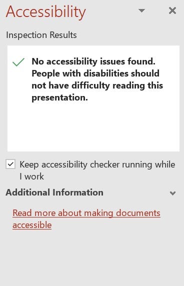
This is what you want to see:
This type of result means you have some more work to do:
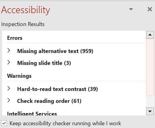
You can open each of these accordions, select the item, and it will show you precisely what object on what page is causing the problem. Once you solve the issue, it drops from the list.
Step 2: Choose an accessible color palate.
- Make sure you use strong color contrast between the background color and the color of the text.
- Avoid color-on-color (i.e., light blue on dark blue).
- Don’t use red and green together without an additional indicator such as a pattern, text, or bolding to help people with color blindness distinguish between the two colors.
- Dark mode is harder to make accessible because you can’t use red or green as colors on a dark background as that will create readability problems for people who are color blind.
- Avoid putting text over images or including images that have text in them as the text pixelates when the user magnifies the object.
- Don’t forget your link and visited link colors when checking contrast.
Step 3: Use templates for repetitive information
If you have an icon or a copyright notice that shows up on every single page, put it in the template rather than dropping it on every page and forcing screen reader users to constantly swipe through information they really aren’t interested in. You can use hidden text (see step 4) to expose the text on the first slide.
Step 4: Use hidden text
“Hidden text” is a sneaky way to make complex visual data much easier to access for people with vision loss. To hide text visually, you make the text color on color — for example, blue text on the same blue background. Hidden text can’t be seen, but screen readers pick it up. Yes, this goes directly against the “avoid color on color” guidance above, but in this case, you only want the screen reader population to access the hidden text, so it’s OK.
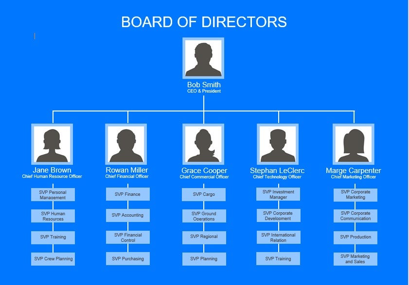
The hidden text for the graphic above needs to convey the relationships between the objects. It could start something like “Company org chart. Bob Smith is the CEO/president. They have five reports,” then describe each report followed by the reports’ reports.
Step 5: Use the speaker notes section
An alternative to putting the entire description in hidden text is to use speaker notes.
- First, use hidden text to tell the users, “please view description in speaker’s notes.”
- Then put the description for the complicated graphic in the speaker’s notes.
Using hidden text and speaker’s notes is preferred over putting long descriptions in alt-text because screen reader users can control how they consume the description at a much more detailed level.
Step 6: Only embed accessible videos.
Three things make videos accessible:
- Captions
- Described audio, if needed.
- Keyboard access to the video player
PowerPoint takes care of supporting keyboard access to the video player, so this recommendation focuses on the first two items on the list, captions, and described audio.
Captions
At only $1 per minute, captioning pre-recorded videos will always be the biggest bang for your inclusion buck. If you have zero budget, create the captions file yourself using Descript.
Video speech rate is almost always faster than presentation speech, making it hard for sign language interpreters and captioners to keep up. In addition, videos frequently have background music, making it harder for the captioners/interpreters to hear the speech they are supposed to be relaying.
- Help your interpreters by giving them access to the video before the presentation.
- Help your captioners by pre-captioning the video, giving them a short break during the presentation.
- Help your users by pre-captioning the video, which will have 100 % accuracy by creating captions before the presentation, instead of captioning in real-time or automatic captioning.
Described audio
Described audio (also called audio description) is a special soundtrack for people with vision loss that includes the audio from the default soundtrack plus additional details that are important to the video that is only visually conveyed.
Not all videos need described audio. How do you know if yours does? Assuming you don’t have vision loss, do the following (or have someone do it for you)
- Watch the video with closed eyes.
- Re-watch the video with eyes open.
If you comprehend something in the second viewing that you didn’t get in the initial viewing, you should get described audio for your video. Alternatively, choose a different video that doesn’t require described audio.
- Animation almost always requires described audio.
- vLogs, interviews, and one-on-one conversations rarely require described audio.
You will need to use hidden text to support providing users with an alternative accessible video. Once you have your described audio link, create hidden text that says “accessible video located at,” followed by the link. The hidden text should be in the reading order *before* the video object in your slide, to avoid confusion. This approach will inform screen reader users where the described audio version is so they know to consume that video and skip the inaccessible video that comes later in the reading order.
Step 7: Describe your informative images by writing good alt-text.
If your image conveys information, it must have alt text. Context in what information the image intends to convey is the most critical aspect of writing good and effective alt-text.
I’ve written an entire article on how to write good alt-text.
Step 8: Actively use the “decorative” option for images that do not contain new information
Some images are just there to be cute or funny and don’t add any meaningful information to the presentation.
How do you decide if an image is decorative? It’s a lot like deciding whether or not you need descriptive audio.
- Review the slide first without the graphic.
- Then re-review the slide with the graphic.
- If no new information is conveyed with the graphic, then it is safe (and actually *preferred*) to mark the graphic as decorative.
When graphics are marked as decorative (which is a check box below where the alt-text would go), screen readers pretend they are not there. If you leave the alt-text empty and don’t use the decorative option, the image will announce as “graphic,” and the screen reader user will have no way of knowing whether it is an informative graphic.
Step 9: Offer to send the deck to participants in advance.
People who use assistive technology are frequently better off navigating a local copy of the presentation while the individual is presenting. Offering to distribute the deck in advance is an expert-level inclusion move.
Step 10: Use the PowerPoint subtitles option.
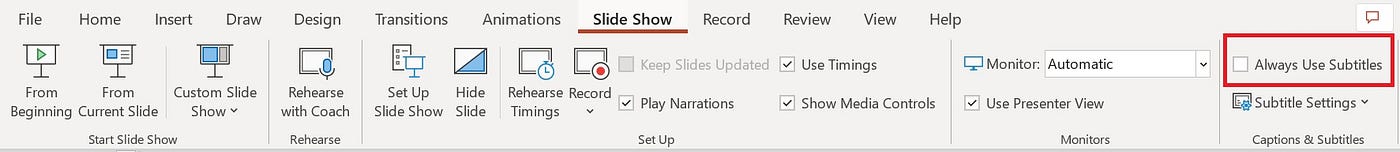
Didn’t know it existed? Many people don’t. “Always use subtitles” is a checkbox in the top right corner of the PowerPoint Slide Show menu bar. You should only select this option if you don’t have captions available through your conferencing system. Otherwise, you will get double captions at different rates of speed and with different transcription errors, which is not a good experience.
Conference systems captions are preferred because they caption all speakers, not just the person presenting the deck. Also:
- Captioning puts the on/off control in the hands of the participants.
- Subtitles are visible to everyone, and participants can’t turn them off. This can adversely impact people who are neurodiverse and not interested in using captions.
If you are presenting the deck with subtitles turned on and get questions during or after the presentation, repeat the questions that come in so that the PowerPoint subtitles will caption them.
It is not hard to integrate these small changes into your PowerPoint decks. Not only are you being more inclusive, but you are also showing others how to be more inclusive as well.