
A design affordance is a clue about how an object should be used, typically provided by the object itself or its context. For example, anyone handling a kitchen utensil for the first time should be able to easily guess which end you hold and which end you use just based on how it looks and feels. There are five different types of affordances that apply to the digital world which have very specific accessibility implications. It is important for designers / developers to identify these and make implementation choices that are both accessible (i.e. WCAG 2.1 Level AA compliant) and usable.
Explicit/Perceptible affordances

An “explicit affordance” (sometimes referred to as a perceptible affordance) is a hint provided by either language or appearance of an object as to the object’s purpose and how to engage it. A button that says “Add to Cart” is a great example of both explicit language and appearance cues. The button’s appearance indicates the possibility of activation and so does the “Add to Cart” language.
There are numerous accessibility implications to an “Add to Cart” button:
1) The button must be exposed (i.e. not hidden) from the screen reader
2) It must have a role of “button” which sets the screen reader user’s expectations for what the control does and how to activate it. Please note: just because you can set the role in ARIA doesn’t mean you should. ARIA is for when you can’t do something in HTML. Period.
3) If the button has an inactive status (i.e. it is dimmed), that must be announced.
4) If there are multiple “add to cart” buttons on a page, extra steps must be taken to make sure each “add to cart” item announces with specificity. This is typically done by adding the name of the product being added to the announcement, such as “add to cart one pound eight-five percent fat free hamburger”
5) If anything else visual changes anywhere else on the page/screen as a result of the addition to the cart, that must be announced also. For example, a change in subtotal from an item being added or removed helps reinforce to a screen reader user that the action successfully completed. Likewise, if an order minimum has been met or free shipping been triggered by the addition of the product, that should be announced as well (and the opposite if deletion of a product means those price points are no longer being met)
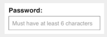
Another type of digital design explicit affordance is shadowtext. Putting “Email Address” in a field as shadowtext is an extra clue to all users (disabled or not) indicating what type of data should go in that field. Shadowtext does NOT replace the need for a plain text string associated with the field, since shadowtext disappears as soon as you start typing.
Pattern/Metaphorical affordance
A pattern affordance is one that has come into being through standard usage, i.e. it is a pattern that people now recognize. The two most common types of pattern affordances in the digital realm are data type patterns and iconography patterns.
Data type
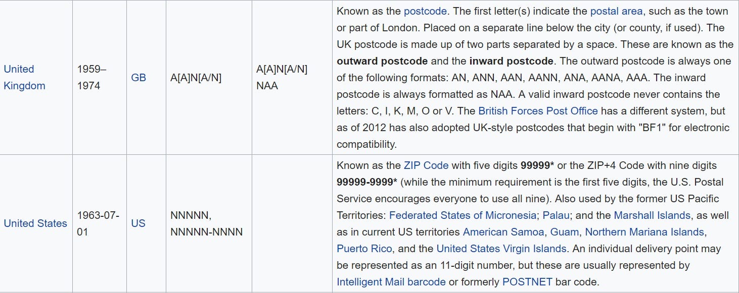
To reduce the chance of making an error when entering data into a form, designers frequently make use of field patterns (such as using 9 or N to represent a number or A for a letter). For example:
“99999” or “NNNNN–NNNN” for a US zip code
“999–99–9999” for social security number
AAA-99 for a class identifier where the first three characters are letters and the last two are numbers
These data type field patterns help reinforce the type of data that the field expects. Data type field patterns can be implemented as shadowtext (see above) or associated with the field itself. If they are associated with the field, there are two options:
1) Place the data type field patterns above the field so that screen readers will pick it up before they go into the field
2) Place the data type field patterns below the field (typically a UI designer’s preference). When the pattern visually appears underneath the field, best practice is to add a small amount of extra code to make sure the pattern is announced when screen reader users enter the field.
Using hover behavior (or any type of touch-only activation) to expose information about data type field patterns is never accessible because all behavior that exposes new, meaningful information must be reachable by the keyboard.
Icons
Frequently, pattern datatypes can include pictures / icons which have entered the public mindset as standardized iconography via the public’s usage and exposure of the pattern. The usage of an “X” to dismiss a dialog or the picture of a trash can to delete an object is now the defacto standard for these operations in the digital arena.
Representing a delete function as a picture of a trash can is a classic example of skeuomorphism, the design concept of making items resemble their physical counterparts. Skeuomorphism is commonplace in many digital and non-digital design fields. Other examples of skeuomorphism include having email be represented digitally by an envelope icon or having a checkout operation resemble a physical grocery cart.
Pattern affordances that are icons frequently rely on metaphorical affordances such as the imitation of real objects. For example, an old-fashioned video camera is often the icon for “record”, and a paper map with multiple folds is frequently the icon for “directions”. Even if the physical object such as an 80’s video camera is no longer in use today to perform recordings, the object is linked in public consciousness with the action.
Pattern affordances are helpful for people with disabilities. They also benefit people who are illiterate, and English Language Learners. Icon pattern affordances are great for communicating shortcuts, but one caveat is that users must understand the intent of the icon for this communication to be successful. Trial and error is not a good way to establish this knowledge.
Accessibility concerns pertaining to icon-based affordances include:
1) Think about how users will be exposed to the meaning behind the icon. These can include first time use screens, formal tutorials, hints, or even accessible chat where users can ask customer support reps questions about the icon in question.
2) Clear and short alt text representing the *operation* the icon performs rather than what it looks like is important. X should announce as “close” and a trash can should announce as “Delete” followed by the name of the object the delete operation would be performed on. Screen reader users don’t care that it’s a picture of a trashcan, they just want to hear “delete 6 bananas button” so they know both 1) what it is they are deleting, and 2) what type of object it is, so they know how to activate it.
Hidden affordance
Hidden affordances in the digital world are functions/objects that are not available until an action has been taken to reveal it. By their very nature, hidden affordances require more effort to make accessible. Take for example, “swipe left to delete” which is a hidden affordance in common use to native apps.
1) You need to inform screen reader users that “swipe left to delete” functionality exists since there is nothing visible by default for the screen reader to pick up. This can be done when the user enters a screen/page where the operation can be performed, or when the object to be acted on receives focus.
2) You need to implement a keyboard equivalent for performing the action. This is an absolute accessibility show-stopper if not done. Designers / Developers cannot assume that a user is able to touch a screen or has enough fine motor skill coordination to reliably perform interactive activities without a keyboard.
Other hidden affordances that are accessibility-specific include deliberately hidden text. Hidden text announces only when a screen reader user swipes and the text block receives focus. Hidden text is sometimes used instead of ARIA to announce specific details. One example of this might include the fact that text that is struck-through which does not get picked up by all screen readers is a “sale price.” Hidden headers can be used to provide screen readers additional navigation information when designers don’t want that information visible.
False affordance
A false affordance is one where the user expects one thing, and something else happens. In the digital world, this would include things like:
1) A button that looks active but does nothing
2) A logo that isn’t linked to anything
3) The words ‘click here’ when the text is not a link
4) A red button associated with a positive action, or a green button associated with a destructive action.
Keep in mind that something that is a bad experience for a user without a disability will be an atrocious experience for someone who can’t see. From the accessibility perspective, a missed value change is one of the most common sources of a false affordance. When you have an object that can change states, including:
· Accordion Controls
· Radio Buttons
· Check Boxes
· Submit Buttons that don’t become active until all mandatory fields are entered
· Expandable menus
The web page / mobile application must announce the name, role, and value when the object is encountered, and announce an update when the value of the state changes. When the value is incorrect or missing, screen readers are either not informed of the current state of the object (checked or unchecked) or given the wrong state (checked, when it is unchecked). Either way, a false affordance is a very negative experience for all users, especially users who rely on assistive technology.
Conclusion
It is the designer’s responsibility to communicate how they want affordances implemented, especially those that are not visible on comps. When this communication does not take place, one of three outcomes is likely:
1) The accessibility requirements for the affordance are not implemented at all
2) The accessibility requirements for the affordance are implemented incorrectly
3) The developers realize they don’t have enough information to implement the accessibility requirements for the affordance, and reach out to the designers before proceeding
None of the three likely outcomes results in efficient SDLC — either something is developed incorrectly that may need to be fixed post-launch, or developers hold up completing and testing a feature until they get more information from the designers. Both cost time and money and can result in launch delays.
Creating an accessibility annotations template for your organization, then completing it and submitting it with every new design will go a long way to ensure that a) designers understand the accessibility implications of their designs and b) developers have a clear path to achieving what the designers intended.
0 comments on “Digital Accessibility Concerns in Design Affordances”