I recently read a Medium article on negative space published by a top design agency. The article had 5000 claps, so it was widely read. Unfortunately, the article’s primary example of good use of dark negative space was completely inaccessible to people who are color blind.
1 in 12 men have some form of color blindness (also referred to as Color Vision Deficiency or CVD) as do 1 in 200 women. That is 4.25 % of the population, which is a significant figure. McDonald’s serves 3 MILLION colorblind customers per day. Over 1.1 million of Amazon’s daily customers are colorblind.
It is completely unclear to me why designers think that it is acceptable to use colors (or combinations of colors) that others can’t see. This is a wide-spread problem that is very easily avoidable. The designers, who generally have unimpaired vision, think their color choices “look good.” However, if people who are color blind or older can’t see them, they are discriminatory. It’s also a ridiculously bad business practice — the whole purpose of thoughtful design is to ATTRACT users to your website / app over that of your competitors, not drive them away.
So what can designers do to avoid producing a design that makes 4.25 % of the population want to go to a competitors site / app?
Run all templates in the style guide through a color blindness simulation
The corporate style guide is the bible for an app or website. The style guide may be what the people in branding want things to look like, but it might not be accessible to people with color related disabilities. A color blindness simulation on all style guide templates will demonstrate to a person with unimpaired vision what something looks like to a person who is color blind. If you don’t have a style guide, then you can do the same simulation on your comps.
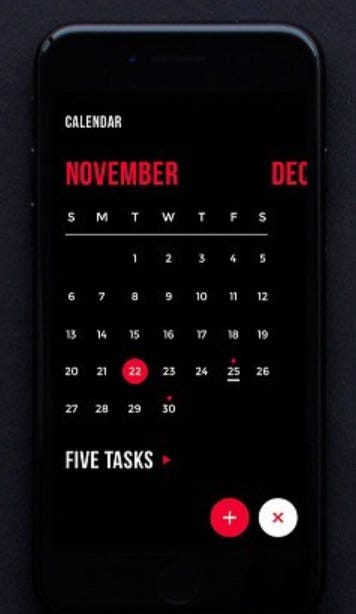
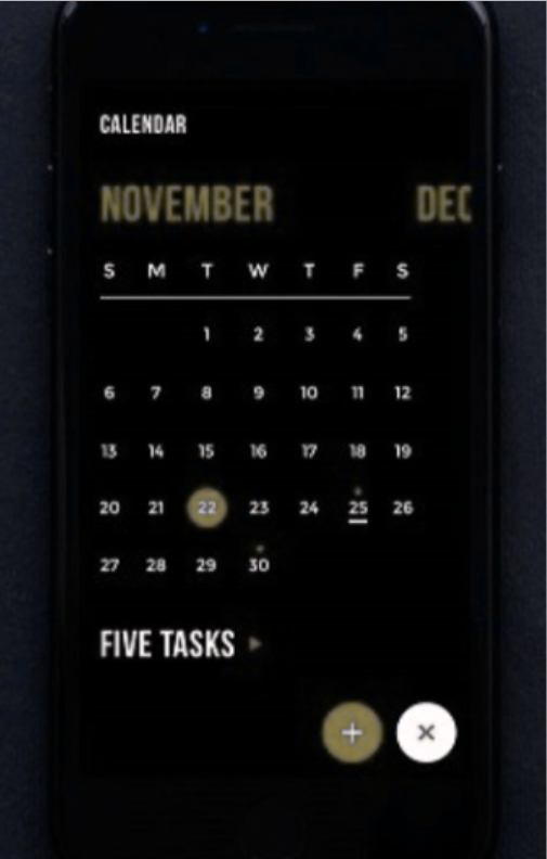
Coblis is a drag-and-drop color blindness simulator. Take a screen shot of your style guide or comp, drop it into the simulation space and then play with the radio buttons to simulate what something looks like to people with various types of color blindness. Of the nine options provided by Coblis, Red-blind (aka Protanopia) and green-blind (aka Deuteranopia) are the most common types of color blindness.
The resulting image is how your design will appear to people with the form of color blindness you have selected.
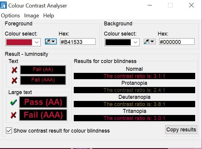
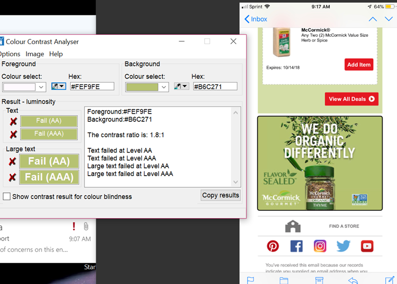
· If it meets the relevant minimum color ratios, keep it.
· If someone with unimpaired vision has trouble seeing components or reading text, the design may benefit from tweaks either to the foreground or background colors to get better contrast.
Check what’s in production (currently) and re-check every time a content update is performed
It is important to review all final content and subsequent updates to see whether the relevant content is meeting the minimum color ratio requirements.
· In WCAG 2.0, the color ratio minimums apply only to text.
· However, WCAG 2.1 extends the color guideline to activatable graphics and the keyboard focus indicator.
It doesn’t matter where the content comes from. Content provided by third-party partners must also meet the color ratio minimums.
Also, don’t forget to test the colors any time the text color changes. This most typically happens for hover states and visited links.
Don’t put hundreds of hours into making your site/app infrastructure accessible only to break it by allowing someone to update the content without making sure the new content meets the color ratio minimums.
Do a high contrast version of your site
While this is not required by WCAG, some websites have high contrast versions available. High contrast versions typically make sure that all meaningful text is on the highest contrast background possible. High contrast versions also frequently simplify the UI by removing content that is there for design purposes only, such as background images.
Note that under the recent Scandinavian Airlines case, the default version of your site still needs to meet the minimum WCAG color ratio guidelines.
When implementing a high contrast version of a site:
· Make sure the “high contrast” link or icon is in the header or footer so it is available on every page.
· Make “high contrast” a single-click change that is continued once selected when viewing new pages on the same website
Never use color by itself to indicate importance or status
A few people who are color blind can’t see color at all. The most common form of color blindness interferes with the ability to see red and green which is important since it is the “stoplight” colors that are typically used to indicate OK (green) and Error (red). Augment color choices for importance and status by adding one of the following features.
Icon with Alt-text
The automotive emergency icon or a dark red X on a light background is good for indicating that something is an error, while a dark green checkmark on a light background is good for indicating that something has been successful.
Appropriate alt text for these icons would depend on the circumstances. If there is enough information in the written text that makes identifying the graphics repetitive, these graphics could be considered decorative in which case alt should be set to null.
Styling
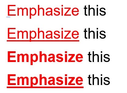
Adding bold or underlined styling will help make red text stand out to people who can’t see red. Use semantic markup for styling so screen readers will call it out. The use of <b>, for example, is hidden to a screen reader user
Box
A decorative box (make sure the alt is set to null) is one way to make text stand out

Don’t use the following colors or color combinations
· Red on any dark color
· Green on any dark color
· Red and green together
In addition to the above guidelines for color blindness, it is estimated that up to 30 % of people over the age of 65 cannot see silver, light gray, and pastels (especially blue and yellow)
· #949494 is the lightest gray usable for a large font and be WCAG compliant
· #767676 is the lightest gray usable for a small font and be WCAG compliant
Conclusion
No one wakes up in the morning and says “I’m going to discriminate against someone today.” However, that is exactly what is happening by not reviewing text color as it appears to people with color blindness. Tell your potential colorblind and older customers that you are thinking about them by following some of the simple guidelines suggested in this article to make your content readable by everyone.
0 comments on “Color Blindness Considerations for Designers and Content Managers”