As previously promised, I am going to to a deep dive every month on implementing features associated with the new WCAG 2.1 AA guidelines. Last month’s discussion was on the deadline for implementing the new guidelines. This month’s deep dive is on touch target size.
Touch target size seems like an insignificant thing to implement. Make the activation area big enough that people with poor fine motor skills can activate the control with a minimal amount of difficulty. How hard can that be? Is that really worth an entire Medium article? Turns out it’s a lot more complicated than one would initially think.
W3C used Github for tracking all questions and comments pertaining to the WCAG 2.1 update. Looking at the comment stream in the WCAG 2.1 github repository, out of the 24 issues discussed, touch target size won second place for most number of comments.
Adding to the confusion surrounding the WCAG 2.5.5 guideline is the fact that it appears that minimum touch target size may have originally been proposed to be a AA guideline, and somewhere along the way, got moved into AAA.
Despite the fact that WCAG 2.5.5 ended up as an AAA requirement, I feel it is important to consider implementing minimum touch target size as a best practice. Small touch target sizes impact people with several different types of disabilities as well as potentially creating a poor user experience for people without disabilities.
- People with vision loss may have difficulty seeing a small target
- People with poor fine motor skills may have difficulty activating a small target
- People with large fingers may accidentally activate multiple adjacent touch target sizes
- When users end up in the wrong place because they activated something that they didn’t intend to, they have to take the time to get back which adversely impacts people with memory loss who may not remember where they came from. In UX testing, this has been shown to lead to cart abandonment because users get frustrated with the process
How big is 44 CSS px anyways?
Apple started it all in their Human Interface Guidelines, recommending 44 pt as the minimum recommended size. Note: the Apple recommendation of 44 pt should not be confused with the WCAG 2.1 recommendation of 44 CSS px; they are not the same units of measurement.
It can be difficult to wrap one’s head around the way CSS relates its pixel measurements to other more common units of measurement. Until a few years ago, CSS pixels and screen pixels were equivalent. As a consequence, a CSS inch did not always map to an actual physical inch. Now, that is no longer the case. The current CSS pixel is a reference measurement of exactly 1/96 of an inch, making 44 CSS pixels always slightly under half an inch.
This new sizing assignment makes sense from the accessibility perspective because the minimum target size a user needs does not change based on what type of device the user is working with. Finger size and hand control limitations do not change based on whether a user is on an iPhone 6 or an iPad 2. This great article explains more about how CSS pixels relate to real world measurements.
Making a 44 CSS px minimum touch target size work
- A 44 CSS px minimum touch target size doesn’t mean that icons have to be 44 CSS px

Most people immediately think “damn, icons have to be 44 CSS px square now, that is really big”. That is actually not the case. The activatable target size has to be 44 CSS px, the icon itself can be smaller if additional white space padding surrounding the icon/string increases the final touch target size.
2. Make icons and associated text a single activatable unit
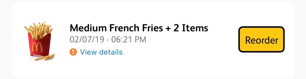
This is an example where a disabled user-friendly option could have been chosen, but wasn’t. Not only are all of the items in this native app screen shot independent components requiring three swipes to get through, the container itself is not activatable, only the link and reorder button are (and the button does not appear to be 44 CSS px high). Text links are exempt from the 44 CSS px touch target size requirement because making them 44 CSS px would disrupt the surrounding text flow. Probably technically WCAG compliant but not a great experience for a screen reader or switch user.
Combining text with graphics into a single activatable component reduces the number of swipes required by a screen reader user to get through the app and increases the touch target size to reduce inadvertent activation for non-disabled users. Making this change does not modify a single thing that is visually apparent to sighted users. I strongly recommend people make the choice to do this.
3. Consider implementing independent mouse and touch modes
For HTML where a site can be accessed from both laptops and mobile devices, create independent modes for touch and mouse where:
a. “mouse mode” is the default on laptops, where activatable components are smaller and closer together.
b. “touch mode” is the default on mobile devices where activatable components are bigger and spaced further apart
c. the option to change modes is available to the user
These defaults are valid assumptions because most users with significant disabilities use keyboards, not mice. By putting control of touch vs. mouse in the hands of the users, when the default assumption is wrong, the user can quickly change it to their preferred mode.
Best practices to combine with minimum touch target size
- For activations that cause catastrophic data changes, ask the user to confirm
This would include things like emptying a cart or restarting an ordering process. This can be easily done through a modal dialog requiring the user to press “continue”.
- Make it easy to go back

Mis-activation will happen even in the best designed systems. Having an easy to identify “back” button or undo process will avoid the frustration that leads to cart or process abandonment.
Conclusion
Minimum touch target size is trickier than it looks to implement. Because so many groups of people with disabilities are adversely impacted by small touch target sizes, it is important for designers and developers to give a lot of thought to minimum target sizes on various platforms.
0 comments on “Accessible New Years’ Resolutions — Touch Target Size”