This is not a game you want to win. Especially in Blackout mode

You know that conference call Bingo meme? I adapted it for accessibility 🙂
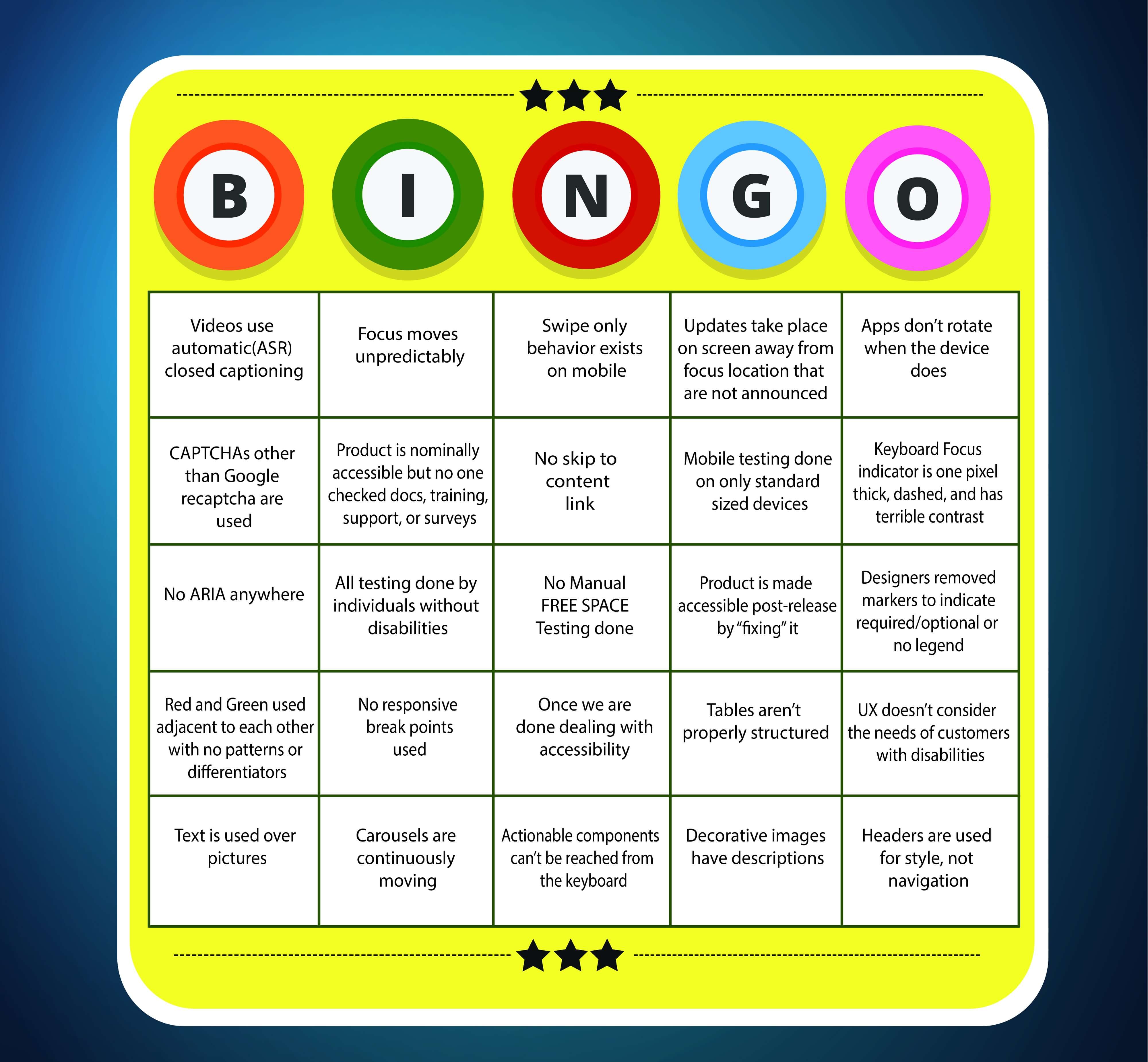
I picked the 25 most annoying and impactful #AccessibilityFail behaviors that I could think of and organized them into a bingo card.
The Free Space — No Manual Testing done
I marked this one as the “free space” since it is a combination of high impact and frequently seen which makes it the worst of the worst. On a good day, automated testing covers 30 % of the accessibility guidelines. Max. You need humans to analyze whether the header structure is accurate or the focus order is any good and the remaining of the other 70 % of behavior. While some of the 70 % of manual tests are good candidates for machine learning, we aren’t there yet.
Videos use automatic (ASR) closed captioning
Number two on my #AccessibilityFail list is no closed captioning or the use of ASR (Automated Speech Recognition) captioning. This fail is on behalf of my deaf daughter. ASR is a poor excuse for closed captioning. It is 80 % accurate on a good day, dropping into the 60s if you have non-English speakers or the video contains a lot of technical jargon. If you wander to a website that doesn’t use custom closed captioning, you should be taking your business elsewhere. Ask Harvard and MIT how ASR captioning worked out for them. Harvard caved in earlier this year, and MIT is continuing to spend probably tens of thousands in legal fees for an indefensible position.
Focus moves unpredictably
This is the number one complaint I have heard time and time again in doing UX research with screen reader users. They are incredibly frustrated when the focus jumps. It’s a double whammy:
- they have to figure out where they moved TO
- they have to figure out how to GET BACK
One person I talked to says when this happens he gives it five minutes to find his way back. If it takes longer than that, or happens a second time, he bails out and goes to a competitor.
Swipe only behavior exists on mobile
Swipe-only behavior on mobile leaves out people who can’t touch the phone.
- Make sure you have a compliant keyboard shortcut for all swipe behavior.
- Make sure you have a way to tell the users about that keyboard shortcut. ARIA alone is not sufficient. People with vision sometimes can’t touch the phone.
Actionable components can’t be reached from the keyboard
Keyboard access is the basis for EVERYTHING. People who can’t use a standard or adaptive/oversized keyboard (think: Steven Hawking) can use eyegaze software, a switch, or a sip and puff device. Manual keyboard testing for all software is essential to ensure you have not made the colossal #AccessibilityFail of having actionable components that can’t be reached from the keyboard.
Updates take place on screen away from focus location that are not announced
Classic example — I put two bananas in a shopping cart using a +/- stepper, then delete one of them. Here is what should happen:
- When I click on the + stepper, it should announce with specificity — “two bananas added”
- When the price updates, that should get announced too “1 dollar 48 cents subtotal”
- If something happens that triggers a coupon, delivery charge changes, recommendations etc., that should be announced too.
- If I delete one of the bananas it should say “one banana removed”.
- Steps 3 and 4 also apply here.
If this is not what is happening on your app or site, that is an #AccessibilityFail.
Apps don’t rotate when the device does
People who can’t touch their mobile devices have their devices on a fixed frame, typically on their wheelchairs. Therefore, they can’t rotate their devices if your app only works in landscape or portrait mode. This guideline is really a curb cut, because it benefits people without disabilities as well. Your app doesn’t have to work perfectly in both modes, but it does have to rotate and keep the focus (see Focus Jumps above if you don’t know why this is important).
CAPTCHAs other than Google reCAPTCHA are used
Just say no to CAPTCHAs. They can take 15 or 20 minutes to navigate for someone who is blind. Even accessible CAPTCHAs don’t have high levels of usability. Honeypots, text message verification, or biometrics are much much much preferable. But if you *have* to use a CAPTCHA, for gosh sake you have exactly two options. Pick one of them.
- Google reCAPTCHA v3 — sometimes referred to as UnCAPTCHA. This is the one that returns a score of the likelihood of you being a bot. You establish what the threshold of acceptability is to proceed without popping up the amazingly annoying “pick the squares that have a car” boxes
- Google reCAPTCHA v2 — This is the one with the “I am not a robot” checkbox. It also has the “pick the squares” backup, but in v2, it comes up a lot more often, which is why v3 is preferred.
Product is nominally accessible but no one checked docs, training, support, or surveys
It’s great when the product is accessible, but for the experience to be completely equal, documentation, training, support and surveys ALSO have to be accessible. Some training is still done in Flash or Flex (can we all say “Yuck” together?) which can never be made accessible. Make sure your accessibility testing covers all of these things and not just the product.
No skip to content link
As a keyboard only user, I admit I am biased towards this one. Lack of a skip to content link means I have to sit there and hit tab dozens of extra times, or go into screen reader mode and use header navigation. Both are extra work for me. It’s not hard, you code it once and it can be reused on every page for the rest of your product’s lifespan. Just do it !
Mobile testing done on only standard sized devices
There are many defects which only show up on oversized devices, but I’ve never seen something work on an oversized device that doesn’t work on a regular device. People who are blind or have dexterity issues are more likely to be using oversized devices because they need the extra space for magnification or room for dexterity errors. If you only have enough time to test once manually, do it on an oversized device, and especially focus on the pagination counts which is where #AccessibilityFails frequently occur.
Keyboard Focus indicator is one pixel thick, dashed, and has terrible contrast
Again, probably a little bit of my bias as a keyboard only user with glaucoma. Not only does the focus need to be able to move, but I NEED TO BE ABLE TO SEE IT!!! Crafting a keyboard focus indicator that is deliberately at the minimum of the scale to not interfere with the UI is super sketchy. It means you understood the requirement, and deliberately ignored it.
No ARIA anywhere
Just like Fight Club, the first rule of ARIA is don’t use ARIA. But honestly, it is next to impossible to code a compliant HTML page of medium or high level of complexity without ARIA. There are always occasions where to be a truly equal experience you need to announce something differently than what appears visually. That’s where ARIA shines. No ARIA anywhere in your average organizational HTML page means someone really didn’t try that hard to make the page/screen an equal experience.
All testing done by individuals without disabilities
I know how to use a screen reader (six of them in fact). But I don’t use them the way a blind person does, and I have the additional bias of having learned how to use a computer as a sighted individual. It is really important to capture, analyze, and encompass the experience of the disabled individuals you are trying to accommodate in your website or app. And this means you MUST have testers with disabilities on your team.
But wait, you say, my testing is done by one of those accessibility testing consultancies? That’s fine, but it is still your obligation to ensure that they are using testers with disabilities. Some consultancies have 10 % or less testers with disabilities on staff, or subcontract out to charities. Put a reasonable threshold in your contract.
Product is “fixed” to be made accessible post-release
Reactive accessibility is always going to be more expensive, take longer, and result in an inferior experience. Proactive accessibility, that is, designing accessibility into the system is the only way to get on the path of both an accessible AND usable experience.
Designers removed markers to indicate required/optional or no legend
Designers hate the asterisk and legend requirements that apply to forms. But, they are there for a reason. Users with disabilities need these cues to be able to see what fields are required and which are not. Don’t leave them out.
Red and Green used adjacent to each other with no patterns or differentiators
Red/Green color blindness is the most common disability affecting use of technology. If you put red and green together without any other cues, people who are color blind will have trouble processing the data. There are two ways to accommodate this issue.
- Have a “color blind mode” the user can associate with their login (best practice).
- Use some other cue such as numbers or hash marks along with the colors to make the data more easily interpreted.
No responsive breakpoints used
Responsive breakpoints and reflow are essential to good accessibility. There are many many device sizes at this point. You don’t want your text to overflow your container when someone uses magnification. You don’t want your page text to get jumbled and not processed correctly by a screen reader because you didn’t anticipate the use of oversized devices. Make sure your designs account for different device sizes.
“Once we are done dealing with accessibility …”
YOU ARE NEVER DONE “dealing with” ACCESSIBILITY. Accessibility is a PROGRAM, not a project. It doesn’t end. Unless your product is going to go end of life in a short period of time, all UI updates have to be checked for accessibility. Once you are compliant, then you have the opportunity to move on to how to do accessibility better, faster, or cheaper.
Tables aren’t properly structured
Let’s say you have a nutrition table for some crackers where one of the cell values is “9 g”. That information by itself is not useful. If you use ARIA-abbr to announce “nine grams” that is better but still not enough. If you structure your table so the top column cell and first row cell announce every time, you would still visually have “9 g” but it would announce “9 grams carbohydrates Uncle Peter’s multigrain crackers”. That is data that an individual who can’t read visually can work with.
UX doesn’t consider the needs of customers with disabilities
Once your product has reached a minimum level of compliance, the next step is to consult with users with disabilities to find out what THEY want as improvements. Even if you have users with disabilities on your testing team, you should get input from as many different users as possible. There are a number of differences doing user research with users with disabilities, so make sure you understand those differences before you start.
Text is used over pictures
You can make text over pictures accessible, but it is hard. Really really hard. Because the color ratios need to be checked every place the background color changes. If your website/software is available in multiple languages that requirement is even harder, because languages other than English are different lengths and will hit the background images in different places (and hence, touch different colors). It is easier to establish in your corporate style guide not to put text over images.
Carousels or GIFs are continuously moving
This behavior impacts a number of different groups. People with ADHD or Autism are distracted by continuous motion. Also, depending on the coding, continuous motion can confuse screen readers. You have three options here.
- Have a “one touch for the entire page” feature where you can shut off all motion and a login parameter to never allow anything to move unless the movement is specifically turned on by the user. (Best Practice)
- Have an easy way to pause the motion for each moving object if the object moves for more than 5 seconds. (minimum requirement)
- Don’t allow anything to move for more than 5 seconds so you don’t trigger the requirement for a pause mechanism. (alternative)
Decorative images have descriptions
It takes three to five times as long for someone who uses a screen reader to process a page. By adding descriptions for images that aren’t conveying information and therefore aren’t useful to the screen reader user, you are contributing to that process being slow. You do have to set Alt-text, but it should be set to null. (i.e. an empty set of quotes like “”)
Headers are used for style, not navigation
You don’t pick H2 because you want 36 pt bold. You pick H2 because it is the natural place to put that type of navigation marker. You want 36 pt bold? Style it that way !
Conclusion
These are my top 25. What are yours? In the article comments, please add the #AccessibilityFail that drives you nuts, or makes you groan, roll your eyes, and either think or say out loud “not again”.
0 comments on “Accessibility Bingo”